Trends
Trends help you visualize, analyze and understand trends in your product usage (e.g., tracking how often a new feature is used, clicks on key actions), user behavior (e.g., identifying patterns in session durations, navigation paths, or input interactions), or any other key metric. It’s designed to deliver granular insights by displaying changes, comparing them across periods, and drilling into session replays.
Trend use cases
Section titled Trend use casesUsing trends can help you answer many questions like:
- How often do users click on a specific button?
- Which UTM campaign generated the most number of sessions?
- Do desktop users spend more time in sessions than mobile users?
- Are certain browsers experiencing more errors during a session?
- What is the number of sessions for paid vs. free users?
- How many clicks on different buttons occur over time?
Getting started with the Trend card
Section titled Getting started with the Trend cardCreate a new Trend
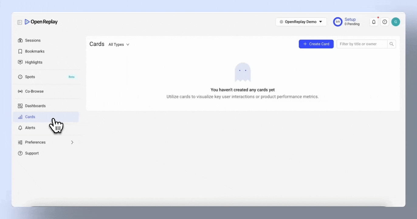
Section titled Create a new TrendYou can access the Trend Card within the Cards menu, under the category “Product Analytics.” Select “Trend Card” to start exploring your data.
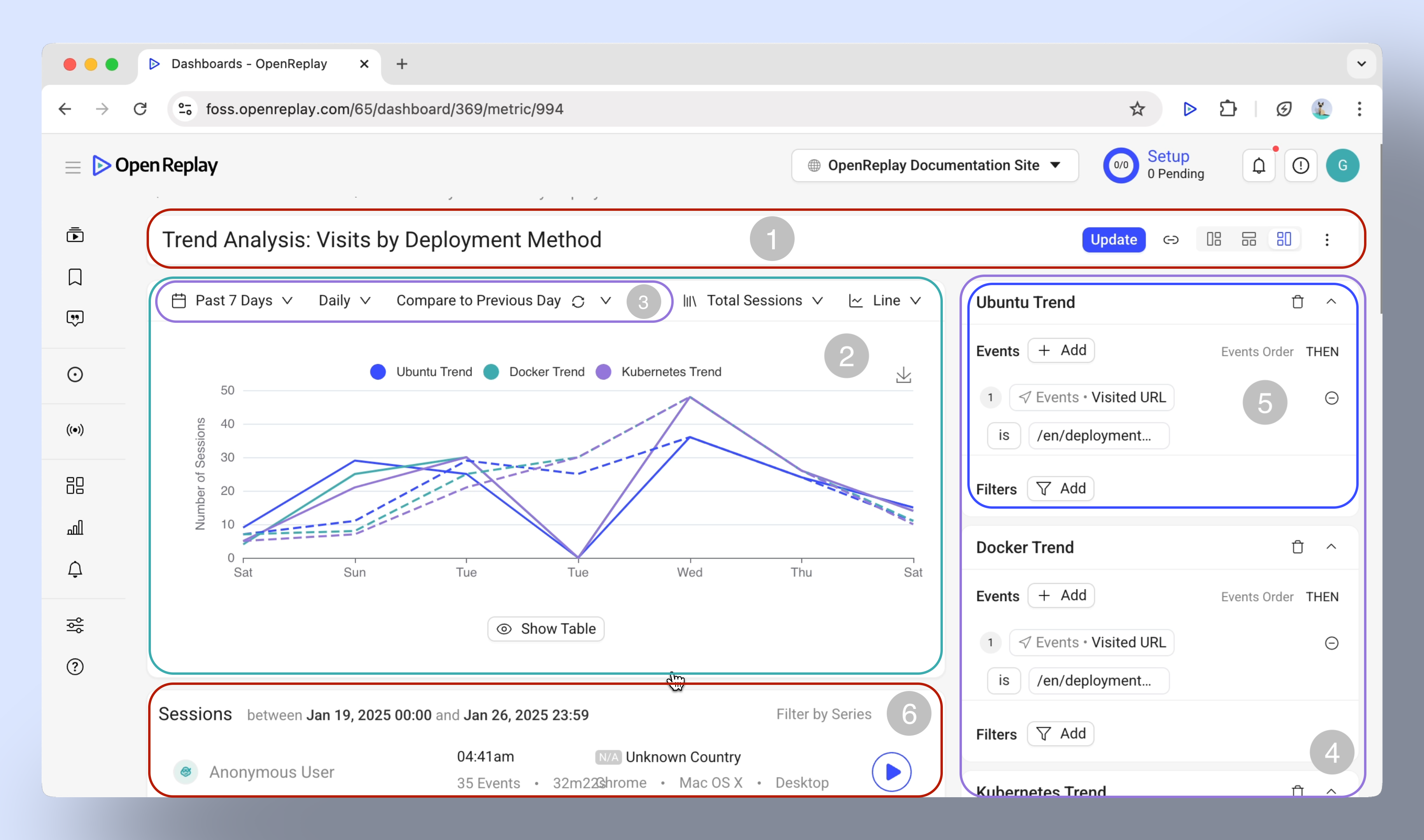
Basic anatomy of the Trend card
Section titled Basic anatomy of the Trend card- Menu bar: Change the display layout, rename, delete or add the card to a dashboard.
- Chart area: Where data is displayed.
- Time range: Adjust the time period to analyze trends.
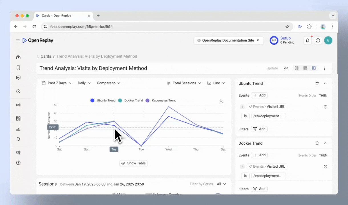
- Series management: Add and compare up to 3 series for layered insights.
- Events and Filters: Select events for each series and narrow down data by user attributes, session characteristics, or specific metadata.
- Sessions list: View associated session data directly linked to specific trends.
Visualizing Trends: chart types
Section titled Visualizing Trends: chart types- Line chart: Best for tracking changes over time, such as daily user signups.
- Area chart: Useful for visualizing cumulative trends, like total revenue growth.
- Column and Bar charts: Ideal for comparing categories, such as browser usage.
- Pie chart: Great for understanding proportions, like device type distribution.
- Metric: Highlights a single key value, such as total sessions in a day.
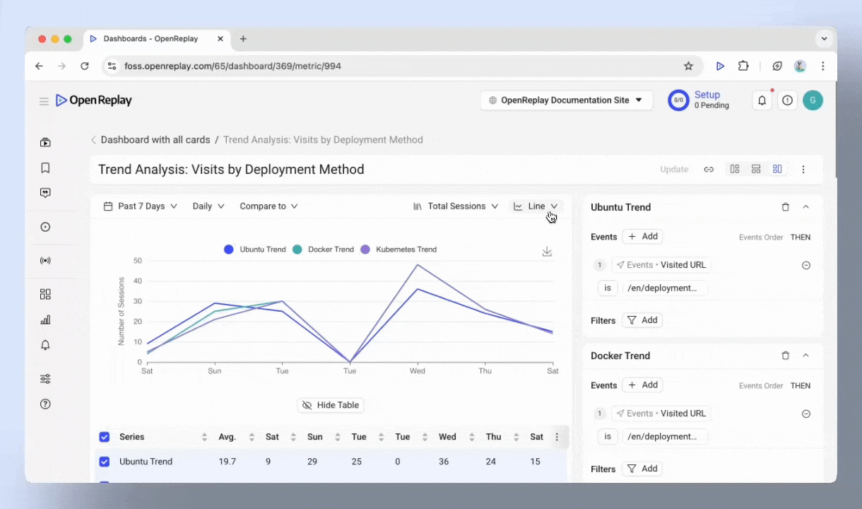
- Table: Perfect for detailed comparisons across different series.
Customizing data views
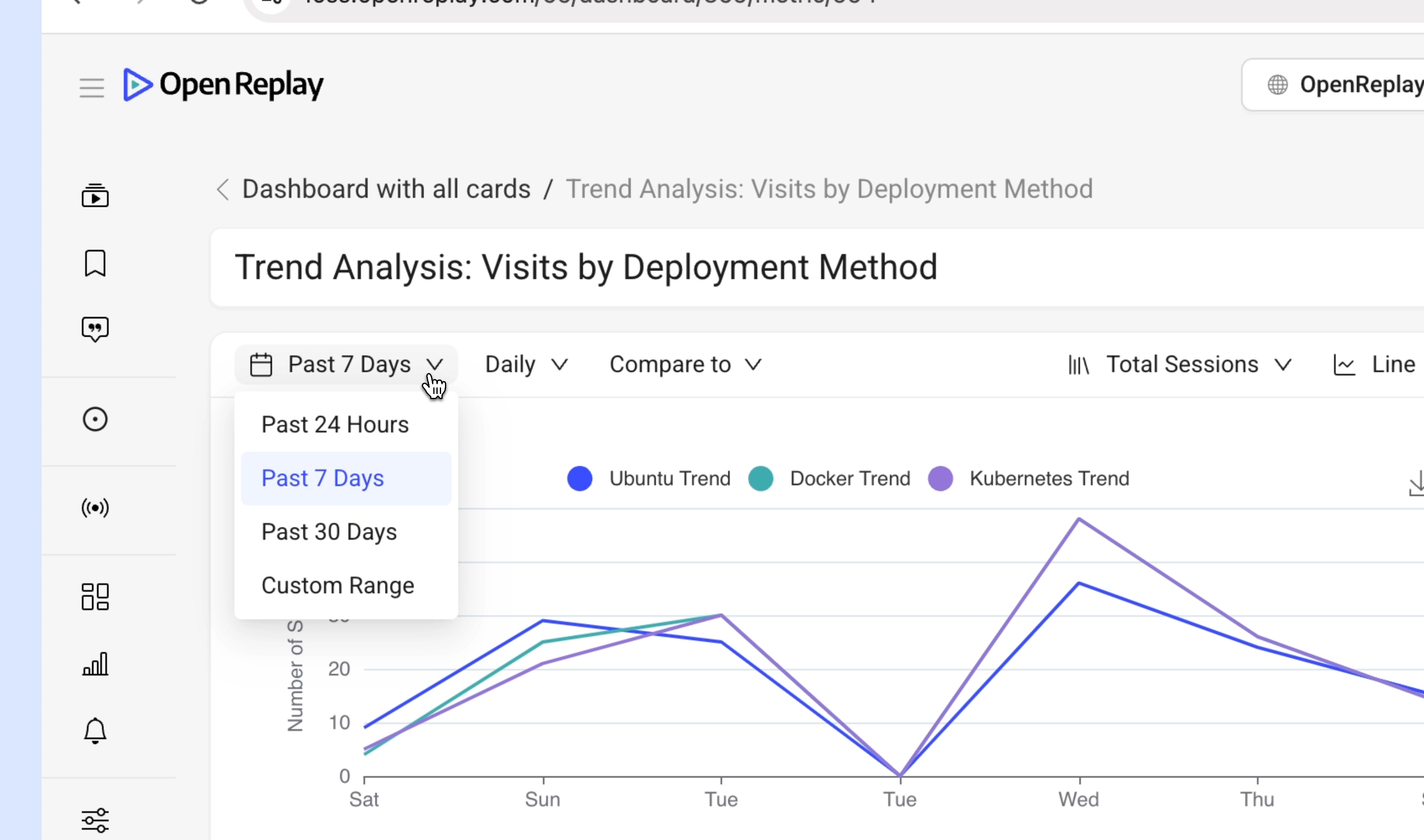
Section titled Customizing data viewsAdjusting the time range
Section titled Adjusting the time range- Preset options: Analyze data from the Past 24 Hours, Past 7 Days, or Past 30 Days.
- Custom ranges: Define specific periods to match your needs.
- Granularity: Switch between Hourly, Daily, and Weekly views to see the level of detail you need.
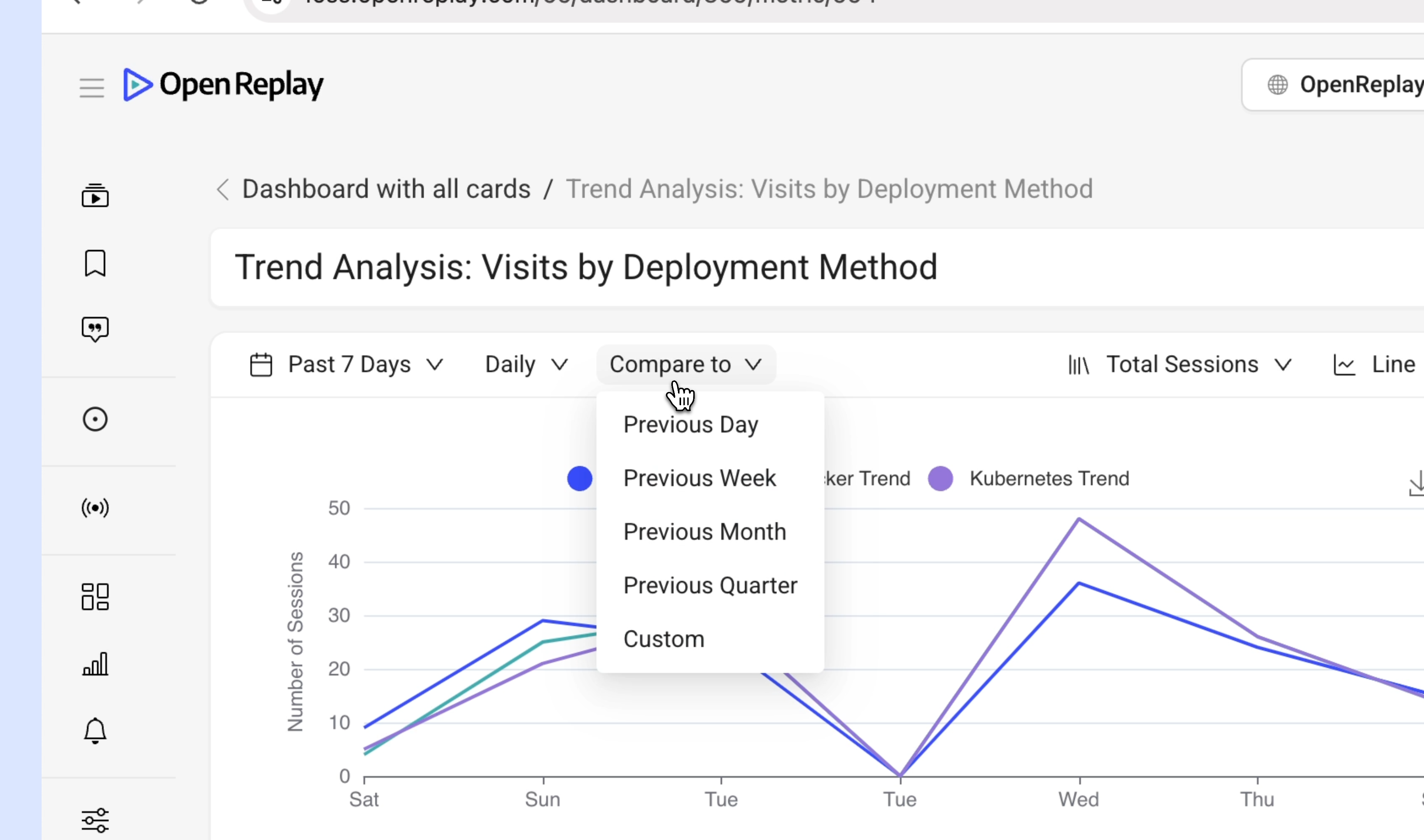
Comparison tools
Section titled Comparison tools- Compare trends with previous periods, such as:
- Previous Day
- Previous Week
- Previous Month
- Previous Quarter
- Custom Ranges
Drill down features
Section titled Drill down features- Click on specific data points to explore session-level details.
Advanced capabilities
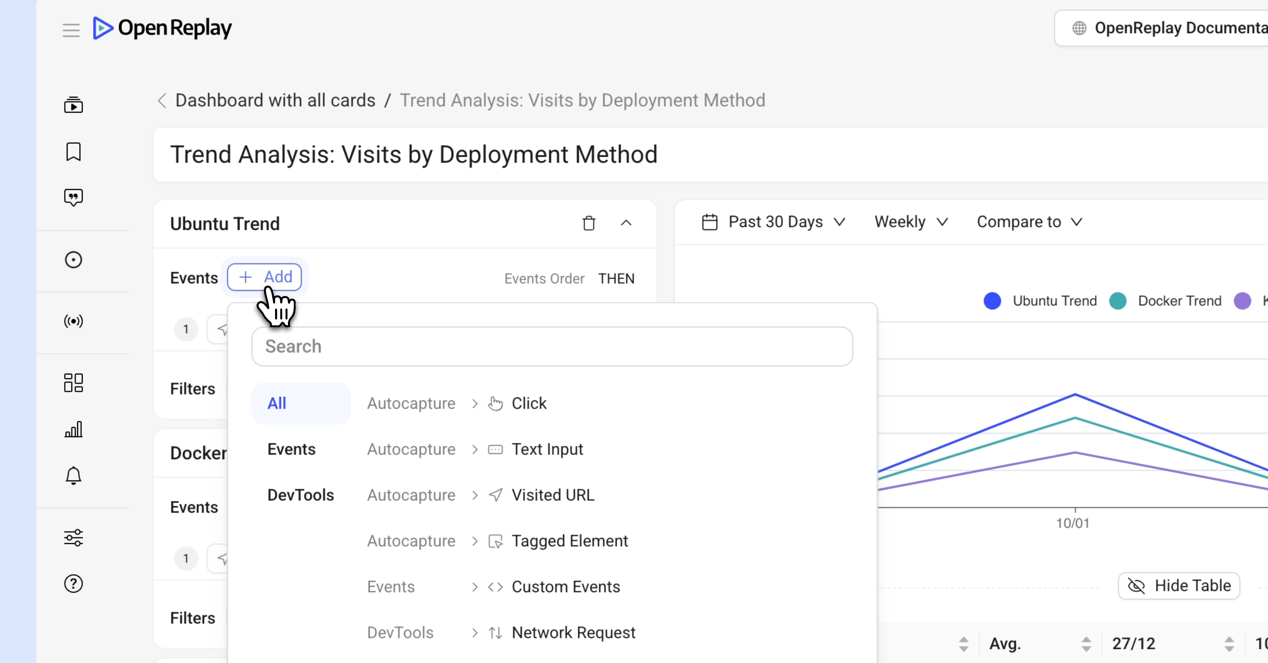
Section titled Advanced capabilitiesEvent customization
Section titled Event customization- Autocaptured events: Visualize trends for user actions, such as clicks, text inputs, and navigation events.
- Custom events: Events sent using the web SDK.
- DevTools events: Analyze technical aspects like console errors, or network requests.
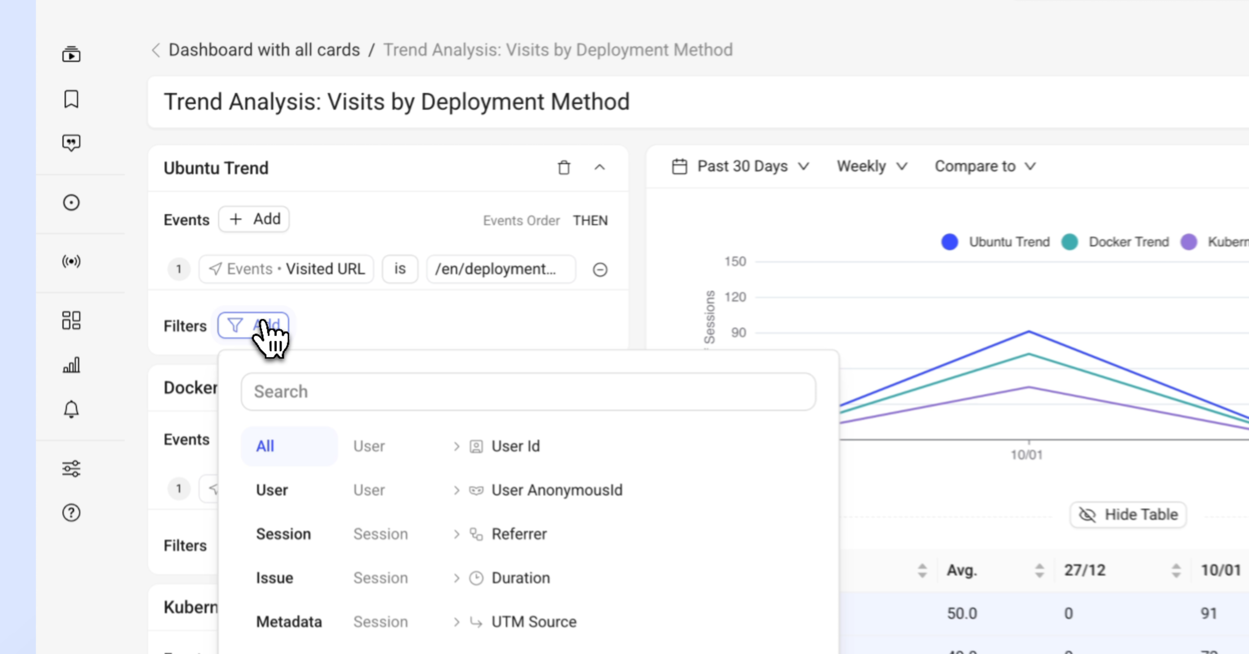
Filters
Section titled Filters- Use filters to narrow down data and focus on specific dimensions:
- User attributes (e.g., User ID, userAnanymousId ).
- Session characteristics (e.g., country, city, OS, Browser UTM Source,… ).
- Issues (e.g., click rage, dead click, bad request,… ).
Export options
- Save visualizations as images for easy sharing with stakeholders.
Make the most out of Trends
Section titled Make the most out of Trends- Adjust the time range and granularity (hourly, daily, weekly) to spot patterns and spikes.
- Compare trends to previous periods (e.g., day, week, month, or custom) to measure the impact of product updates, campaigns, or feature launches.
- Narrow your analysis by applying filters, and drill down into session replays to see exactly what users experienced.
Key Tip: Trends are most effective when you define specific questions or hypotheses before analyzing the data.
Have questions?
Section titled Have questions?If you have any issues creating funnels in you project, please contact us on our Slack community and ask our devs directly!