How to use Dashboards
Dashboards in OpenReplay serve as your central hub for monitoring, analyzing, and optimizing your product’s performance and user experience. Whether you’re debugging issues, tracking user behavior, or measuring performance, dashboards provide the insights you need to make data-driven decisions.
OpenReplay dashboards bring together critical insights for every member of your team:
- For developers: Track technical issues like JavaScript errors, slow network requests, and performance problems in real-time.
- For product managers: Analyze user behavior, monitor conversion funnels, and understand the paths users take through your product.
- For teams analyzing website performance: Track key metrics such as most visited pages, traffic sources, and user demographics.
Overview of Dashboards and available Cards
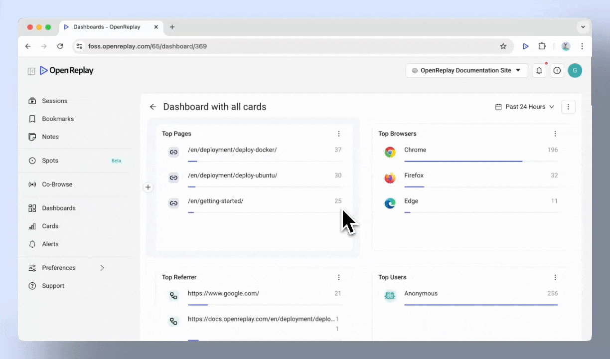
Section titled Overview of Dashboards and available CardsWhen you create a dashboard, it starts as a blank slate, ready for you to customize. Dashboards are made up of cards, with each card displaying a specific metric or set of data. You can add, remove, or move cards around to organize your dashboard as needed.
Cards fall into three main categories:
Product analytics
Section titled Product analyticsProduct Analytics helps you track and analyze user engagement and behavior within your product.
| Card | Description |
|---|---|
| Trends | Monitor session trends over time |
| Funnels | Visualize user progression through critical steps and identify drop-offs to improve conversion |
| Journeys | Understand the paths users take through your product |
| Heatmaps | Visualize user interaction hotspots and patterns |
Monitors
Section titled MonitorsMonitors help you identify and troubleshoot technical performance issues affecting the user experience.
| Card | Description |
|---|---|
| JS Errors | Track JavaScript errors affecting the user experience |
| Top Network Requests | Identify frequently accessed network resources |
| 4xx/5xx Requests | Monitor client and server errors for performance issues |
| Slow Network Requests | Pinpoint delays caused by slow responses |
Web Analytics
Section titled Web AnalyticsWeb analytics provides insights into user demographics, traffic sources, and traffic patterns.
| Card | Description |
|---|---|
| Top Pages | Identify the most visited pages on your site |
| Top Browsers | See which browsers your users rely on most |
| Top Referrers | Understand where your traffic originates |
| Top Users | Find users with the most interactions |
| Top Countries | Analyze your audience by location |
| Top Devices | Analyze your audience by device type |
Creating your first dashboard
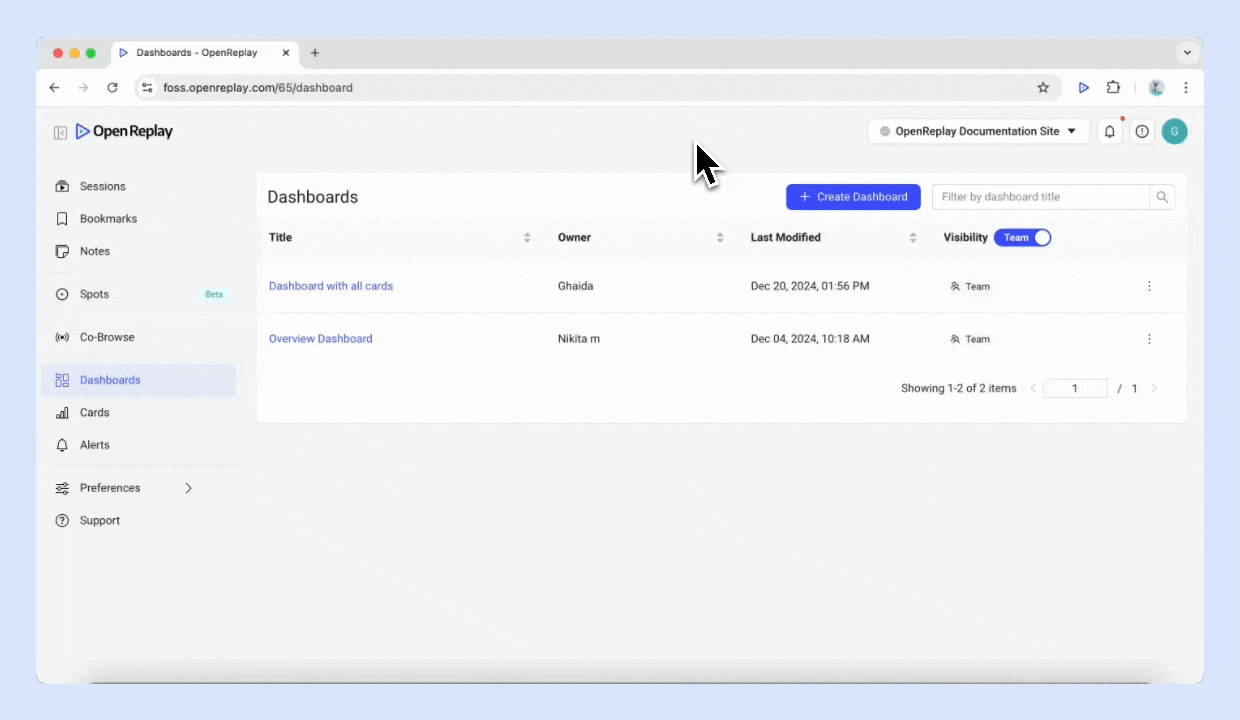
Section titled Creating your first dashboardStep 1: Go to Dashboards, and click the Create dashboard button.
Step 2: Choose one of the three categories. Select the type of card you want to add to start from scratch, or click on Add existing Card to reuse an existing one.
Step 3: Click Create Card to add it to dashboard
Step 4: To add another card, click the ”+” button next to an existing card.
How to manage Dashboards
Section titled How to manage DashboardsOnce your dashboard is set up, you can:
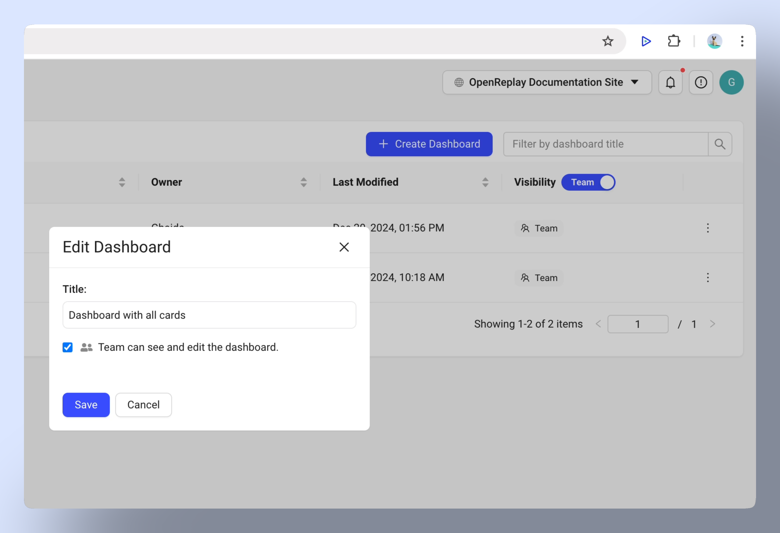
- Rename or delete: Update the dashboard name or delete it if no longer needed.
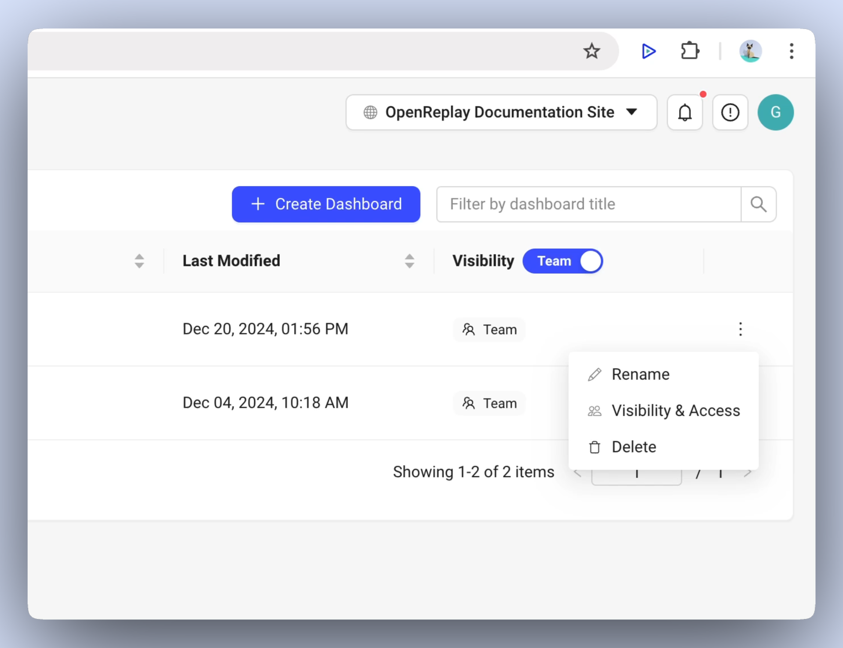
- Change Visibility: Set the dashboard to Team or Private based on who should access it.
- Reorganize cards: Drag and drop cards to rearrange them.
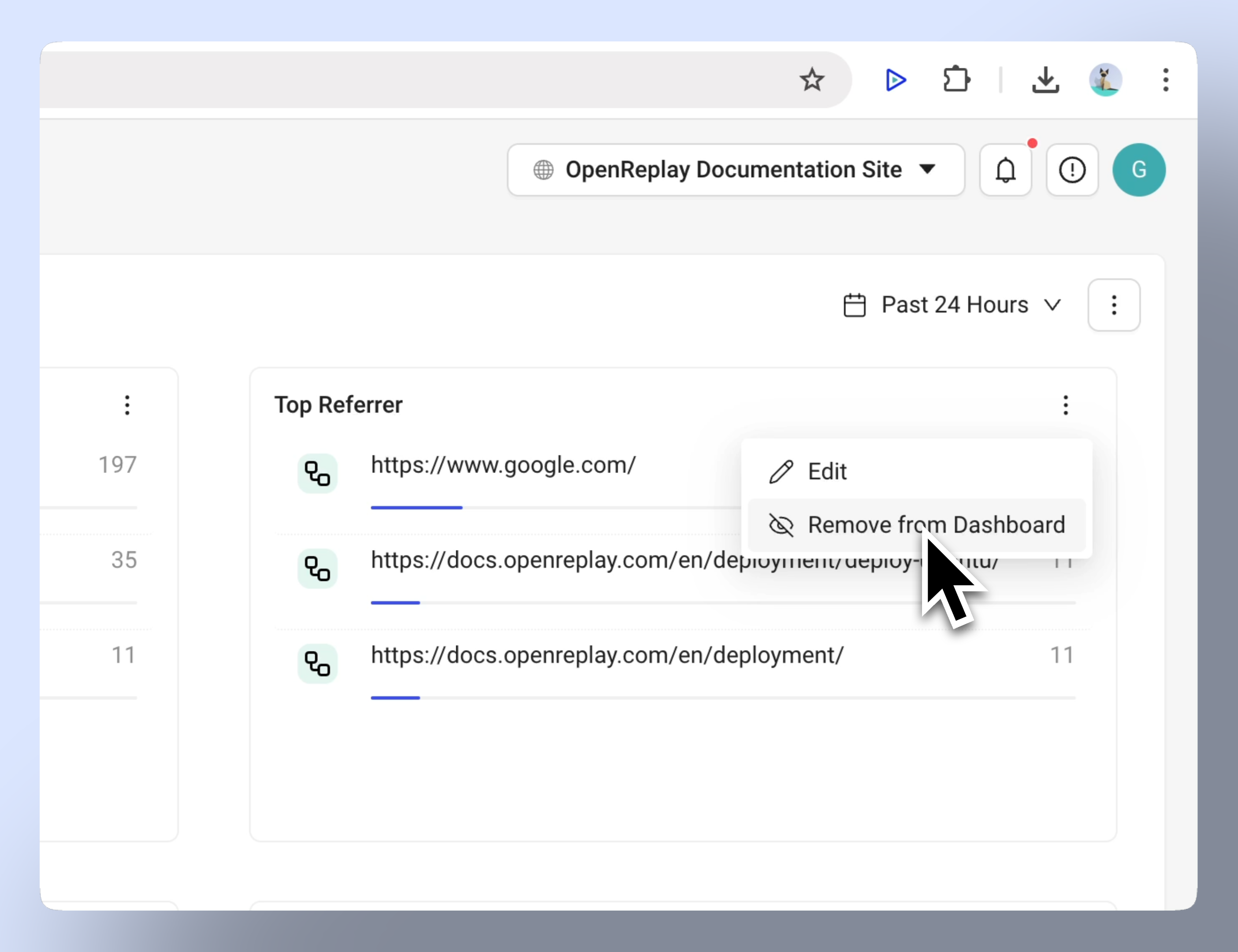
- Remove cards: Use the “Remove from Dashboard” button to delete a card.
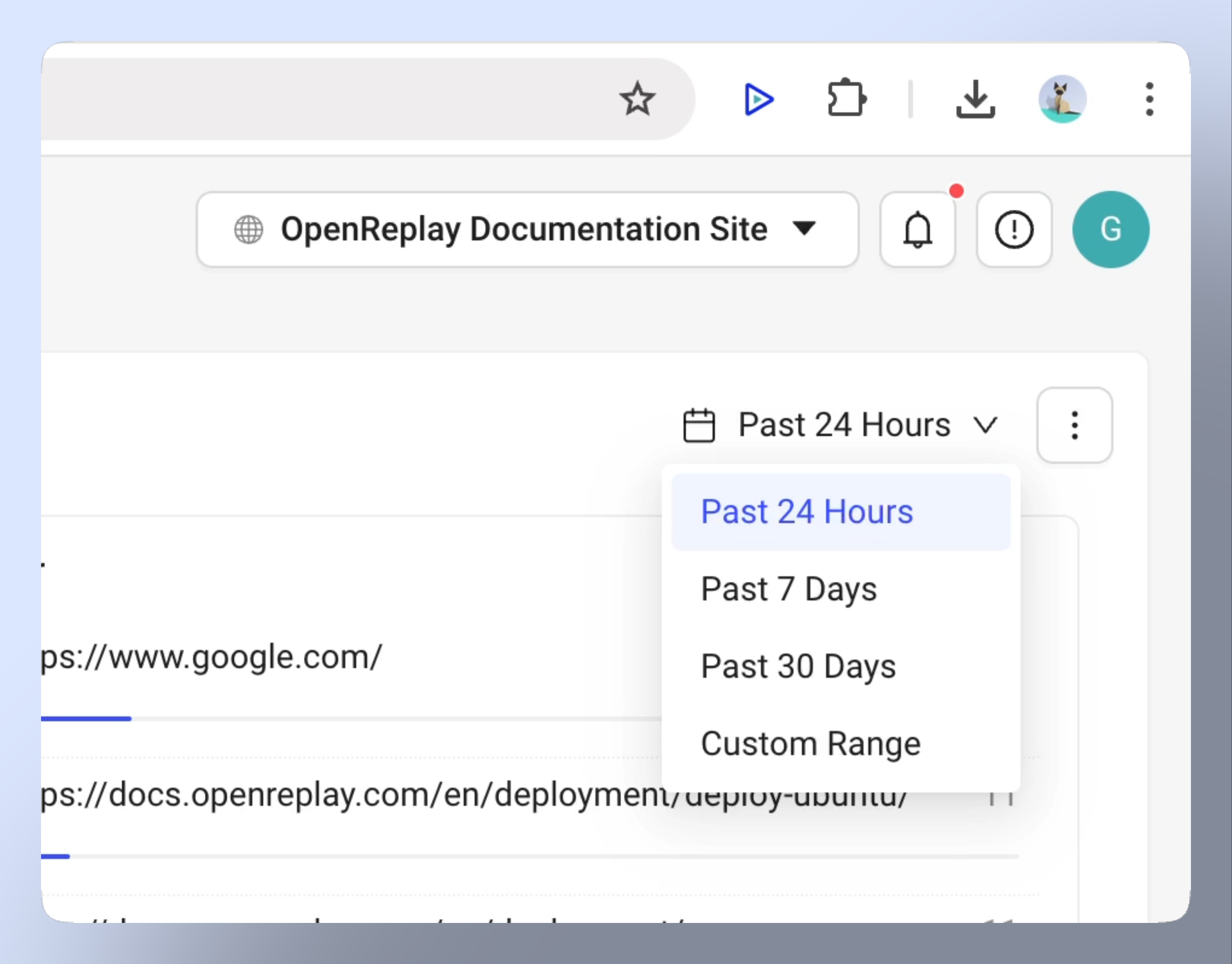
- Filtering: Apply time-based filters (24 hours, 7 days, etc.)
- Download as report: Share dashboard offline (Only for Enterprise Edition)
Common use cases
Section titled Common use casesDashboards are flexible and can be adapted for various purposes.
Here are a few examples:
- Analyze user behavior: Use Trends and Journeys to understand how users interact with your product.
- Identify issues: Monitor JS Errors, 4xx/5xx Requests, and Slow Network Requests to address performance problems.
- Understand traffic: Track Top Pages, Referrers, and user demographics to see what’s working and where improvements are needed.
Create separate dashboards for specific goals, such as monitoring marketing campaigns or tracking technical performance. Dashboards can act as different views of your system and provide an integrated summary of what’s happening.
Have questions?
Section titled Have questions?If you have any issues setting up a custom dashboard in your project, please reach out to us on our Slack community and ask our devs directly!